Introduction
Coloring is often seen as simple, but anyone who colors regularly knows it goes deeper than that.
The moment you pause to choose between two blues or wonder if green really fits, you are already practicing color theory.
When colors work together, a coloring page feels calm, expressive, and complete.
This guide “Color theory for colorists – choosing the colors that wow” breaks color theory down into friendly, usable ideas made especially for coloring pages.
Understanding the Color Wheel for Coloring Pages
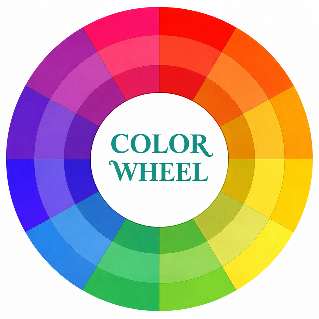
What the Color Wheel Really Is
The color wheel is a circular guide that shows how colors relate to each other.
It arranges colors in a way that makes harmony and contrast easier to understand.
For colorists, this wheel answers one common question: what colors go together?
You do not need to memorize it, just know how to glance at it when stuck.
The wheel starts with primary colors: red, blue, and yellow.
Mixing them creates secondary colors like green, orange, and purple.
Between those sit tertiary colors, softer blends that add variety.
Mini-summary:
The color wheel simplifies color choices and reduces hesitation.
It is a practical tool, not an artistic test.
Writer takeaways:
- Keep a simple color wheel nearby when coloring.
- Use it to plan before you start, not after.
- Even basic understanding improves results quickly.
Analogous Colors: Calm, Flowing, and Relaxing
What Analogous Colors Mean
- Analogous colors sit next to each other on the color wheel.
- Think blue, blue-green, and green used together on one page.
- These combinations feel natural and smooth to the eye.
- They are especially popular in adult coloring for relaxation.
- Because they share similar tones, they blend easily.
- This makes them perfect for shading and soft transitions.
- Nature scenes almost always benefit from analogous color choices.
When Analogous Palettes Work Best
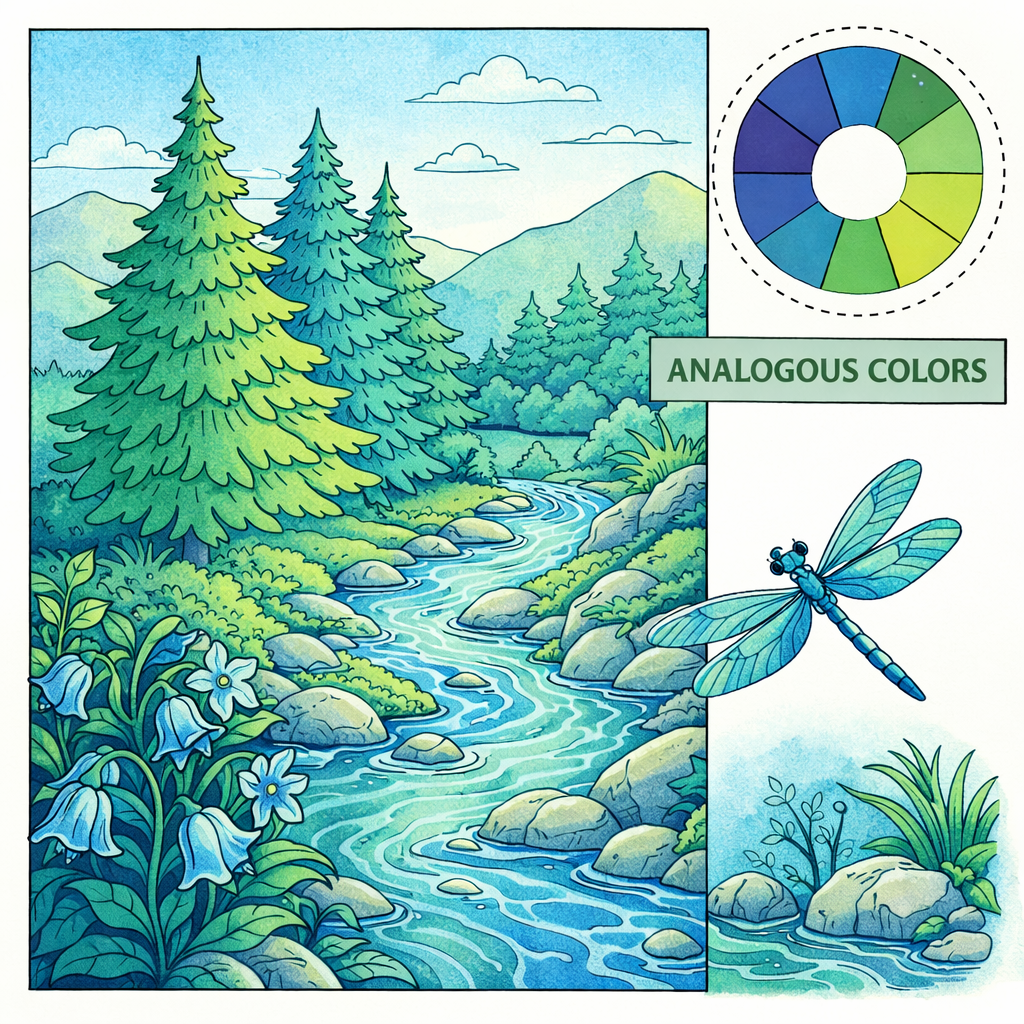
Analogous colors shine in:
- Forests, oceans, skies, and landscapes
- Cozy moments and slow scenes
- Pages with many small details
They create harmony instead of contrast.
Your eye moves gently across the page without sharp stops.
Creative prompt:
Pick one main color and its two neighbors on the wheel, then color a full page using only those three.
Mini-summary:
Analogous palettes feel peaceful and unified.
They are ideal when the goal is calm and mindfulness.
Writer takeaways:
- Great for stress-relief coloring sessions.
- Easy to use, even for beginners.
- Perfect for blending and layering.
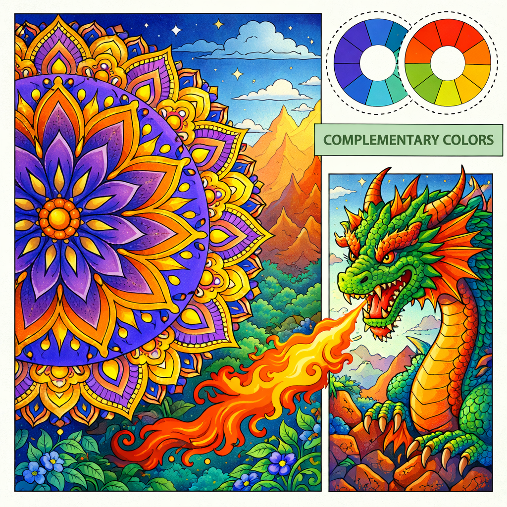
Complementary Colors: Contrast That Pops
What Complementary Colors Are
- Complementary colors sit directly opposite each other on the color wheel.
- Classic examples include blue and orange, red and green, or yellow and purple.
- When placed together, they create strong visual contrast.
- This makes certain areas stand out instantly.
These combinations grab attention fast.
They are often used in fantasy, mandalas, and decorative pages.
Used well, they make a coloring page feel bold and exciting.
How to Use Complementary Colors Without Overdoing It
The trick is moderation.
Let one color dominate and use the opposite as an accent.
Too much of both can feel chaotic, especially on detailed pages.
Good uses include:
- Eyes, flowers, or focal symbols
- Borders and decorative elements
- Seasonal themes like Christmas or Halloween
Mini-summary:
Complementary colors add drama and energy.
They work best when used intentionally, not everywhere.
Writer takeaways:
- Use contrast to guide attention.
- Balance bright colors with neutrals.
- Ideal for statement pieces.
Warm vs Cool Colors and the Mood They Create
Understanding Color Temperature
- Colors carry emotional temperature.
- Warm colors include reds, oranges, and yellows.
- Cool colors include blues, greens, and purples.
- This temperature affects how a page feels, even subconsciously.
- Warm colors often feel active and comforting.
- Cool colors feel calm, dreamy, or distant.
- Neither is better, they simply tell different stories.
Using Temperature to Set the Mood
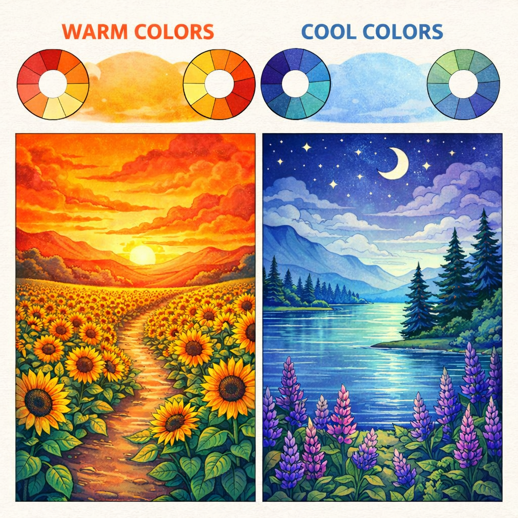
Warm palettes are great for:
- Cozy interiors
- Summer scenes
- Joyful moments
Cool palettes suit:
- Night scenes
- Fantasy worlds
- Quiet, reflective pages
Mixing both can add depth.
For example, a cool background with warm highlights creates balance.
Mini-summary:
Color temperature shapes emotional response.
Choosing warm or cool tones gives your coloring intention.
Writer takeaways:
- Warm colors move forward visually.
- Cool colors soften and calm.
- Mixing temperatures adds realism.
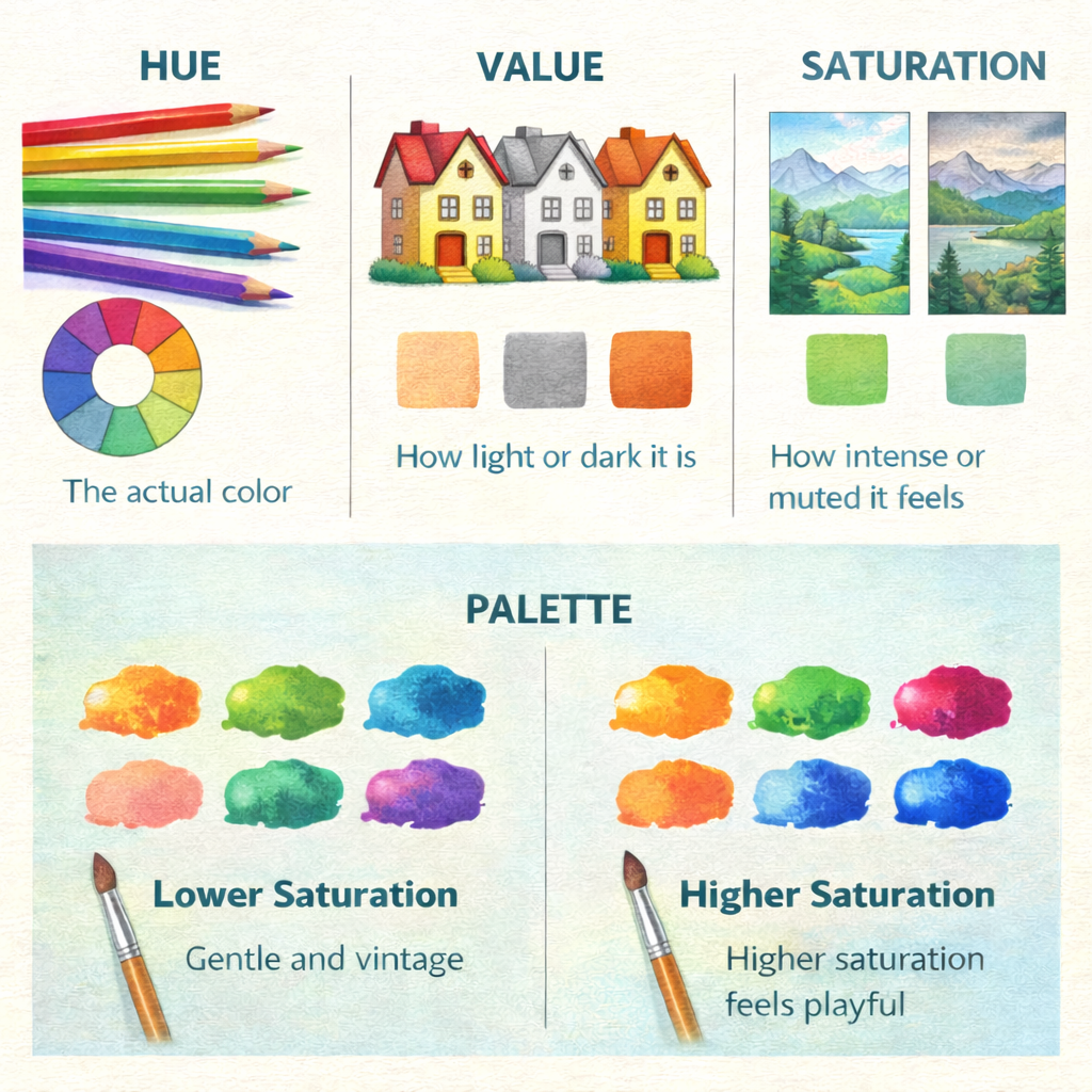
Key Color Theory Terms Every Colorist Should Know
Simple Definitions That Actually Help
You do not need advanced art language to color beautifully.
A few basic terms make a big difference.
- Hue: The actual color
- Value: How light or dark it is
- Saturation: How intense or muted it feels
- Palette: The group of colors you choose
Lower saturation feels gentle and vintage.
Higher saturation feels playful and bold.
Learning value helps more than buying new pencils.
Shading with pressure often works better than adding black.
Mini-summary:
Basic terms give you more control.
They help fix issues without starting over.
Writer takeaways:
- Adjust value before changing color.
- Use saturation to control mood.
- Small tweaks improve harmony fast.
Why Color Choice Matters More Than You Think
Studies in visual psychology show color influences mood and perception.
Research published in Frontiers in Psychology highlights how harmonious palettes increase perceived beauty.
Design experts also agree that limited color schemes feel more intentional.
This applies just as much to coloring pages as to professional art.
At the same time, artists often disagree on strict rules.
Many believe emotional expression matters more than theory.
Both views can exist at the same time.
Mini-summary:
Color theory improves visual appeal and emotional impact.
Creativity still leaves room for instinct.
Writer takeaways:
- Structure supports confidence.
- Fewer colors often look stronger.
- Trust your eye as much as theory.
Breaking the Rules on Purpose
When It Is Okay to Ignore Color Theory

Color theory is a guide, not a law.
Some of the most expressive coloring pages break every rule.
Unexpected choices can create personality and style.
Try experimenting with:
- Neon colors in nature scenes
- Cool shadows on warm objects
- Fantasy animals with unrealistic colors
Creative prompt:
Color an animal using colors that do not exist in nature, focusing only on contrast.
Mini-summary:
Breaking rules can unlock creativity.
Mistakes often become personal style.
Writer takeaways:
- Play keeps coloring fun.
- Rules are tools, not limits.
- Expression matters more than perfection.
Applying Color Theory with ColoringHarmony
Color theory becomes easier when paired with the right pages.
ColoringHarmony.com offers themed collections that naturally support palette choices.
Nature pages work beautifully with analogous greens and blues.
Fantasy and mandalas shine with bold complementary contrasts.
Parents, teachers, and artists can also use coloring as a learning tool.
Matching color lessons with page themes makes theory feel natural.
It turns coloring into both relaxation and gentle education.
Mini-summary:
Theme and palette work best together.
Choosing the right page supports better color decisions.
Writer takeaways:
- Match mood before selecting colors.
- Explore categories intentionally.
- Let the artwork guide your palette.
AI Coloring Page Prompt Ideas
Prompt idea 1:
Coloring Book, peaceful forest clearing with layered trees and soft sunlight, clean line art, relaxing nature theme, bold outlines
Prompt idea 2:
Coloring Book, symmetrical mandala inspired by color wheel sections, balanced shapes, strong contrast areas, clean black outlines
Prompt idea 3:
Coloring Book, cozy evening scene with candles, plants, and blankets, simple details, warm and calming mood
Conclusion
Color theory helps colorists choose with confidence instead of doubt.
Whether you follow the color wheel closely or break the rules freely, intention makes every page stronger.
Explore themed coloring collections, experiment with palettes, and enjoy the calm joy of choosing colors that truly wow.
Popular Free Coloring Page Categories